

If your conversion rates aren’t high enough, it may simply be down to your call to action. Over the last 10 years of copywriting, I’ve seen countless examples where little tweaks, like swapping a single power word in a CTA, boosted conversion rates by well over 100%.
High-performing CTAs address a pain that’s well-known to their intended audience, and they clearly explain the value of clicking. “Shop now” might be serviceable, but “Run pain-free” will close the deal.
For this guide, I gathered 31 absolutly compelling call-to-action examples and dissected what makes them work. I also tapped a couple of conversion marketing experts to share tips you can use to write your own conversion-ready CTAs.
Contents
31 high-converting call-to-action examples for every use case
CTAs can do many jobs, from converting buyers to convincing readers to download an ebook. Find your use case, check out the examples, and try them to see what works for you.
🎬 Want more? Download The 42 Best Call to Action Phrases Ever (& Why They Work)
Ecommerce and direct purchase CTAs
Ecommerce and direct purchase CTAs are the action phrases that appear on product pages, ads, and landing pages to push a ready-to-buy customer over the finish line. “Buy Now,” “Add to Cart,” and “Get Yours Today” are common examples. These CTAs go way beyond common.
1. Get yo’ tickets while they’re hot
Really Good Emails uses a bold and spicy CTA in this ad for its Unspam event.
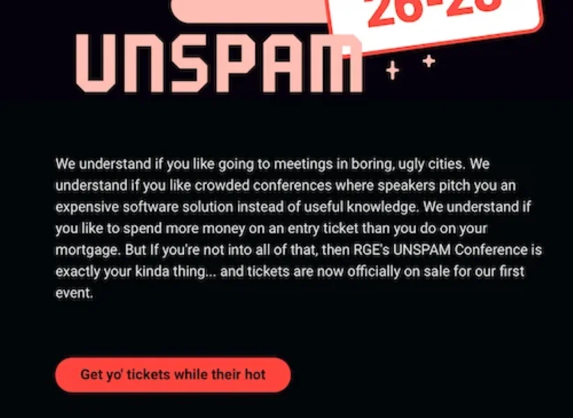
Why this CTA works
Really Good Emails is known for a funny and sometimes edgy tone. Their CTA keeps that vibe while still making it super clear what clicking that bright red button gets you.
Pro tip: Scrutinize every CTA closely. This one has a misspelling (the “their” should be “they’re”). This is not the time to ding your brand image with a silly mistake.
2. Build a manpack
Speak your customers’ language, and you can get them to do pretty much whatever you want. Case in point: this call-to-action example from the men’s grooming product site Manpacks.
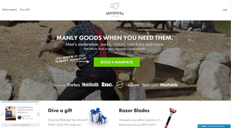
Why this CTA works
By combining imagery that might otherwise be stereotypical (a man in a plaid shirt sawing timber) with strong phrasing (“Build a Manpack”), this company makes putting a male grooming gift box together sound as exciting as building a house—or a cabin in the woods.
Personalizing a CTA to your audience can have a huge impact on conversion. In one study, a personalized CTA converted 202% better than the basic version.
3. Get free card reader
Offering something your prospects really want is a great way to increase conversions, especially if it’s free. If you can manage this, your CTA doesn’t have to be particularly innovative or exciting, as demonstrated by Square’s landing page.
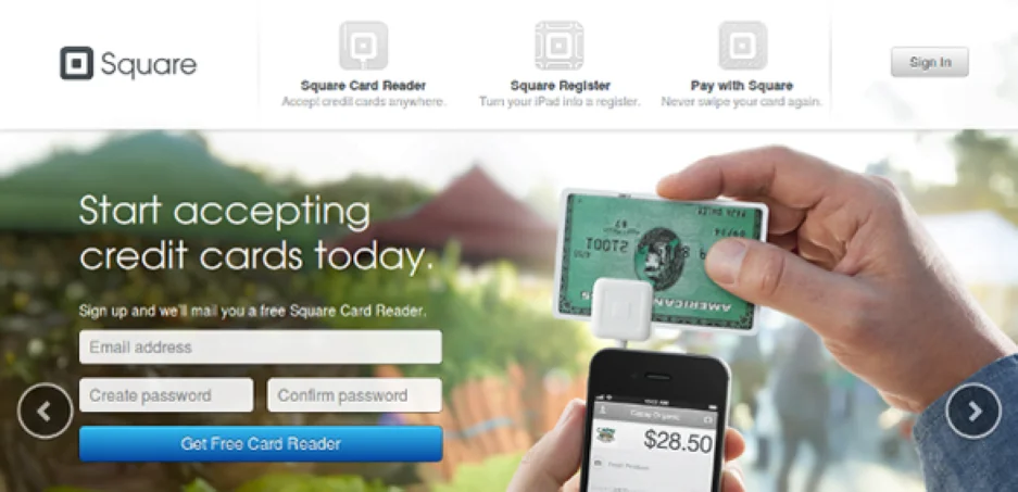
Why this CTA works
This CTA offers something most people want: free stuff. It’s a simple formula that just about any business can use. Just replace “card reader” with whatever free version of your product you offer.
Pro tip: The CTA is the most important copy on your page. Make sure it stands out by using a bold, contrasting color. Square’s CTA could benefit from a little more contrast.
4. Create my resume
My Perfect Resume built a logical workflow that leads right to its CTA.
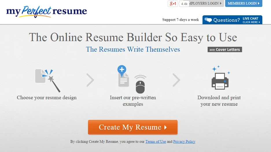
Why this CTA works
This call-to-action example, by itself, is very simple. However, its positioning alongside the step-by-step graphics above it makes it extraordinarily clickable.
When viewers follow the steps on the page, it’s clear that creating a resume (something that is a real pain in the ass to do) is now easy. And the CTA is the next logical step to complete the process.
5. Claim offer
This CTA from Bark Bright focuses on what you get instead of telling you to shop or buy.
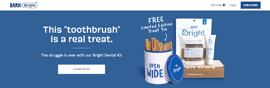
Why this CTA works
Many CTAs tell you to “buy.” That’s not necessarily bad, but it does implant the idea that you’re about to spend money.
This CTA, “claim offer,” has a different connotation. It suggests that by clicking, you’ll get something valuable. Sure, we know we’ll still have to make a purchase, but the subliminal message is more about what we’ll get.
6. Multiple CTAs
Testing is the root of all great copy. Android built A/B (C and D) CTA testing into this clever ad.
Why this CTA works
Each section of the ad is a separate clickable image with a different value proposition and CTA. They all lead to the same landing page. What’s so clever is that Android can now clock which CTAs drove the most clicks.
7. Shop jeans, shop pants
Speaking of multiple CTAs, this Wrangler ad has two to choose from.
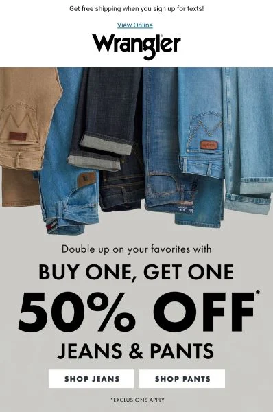
Why this CTA works
Any time you can reduce friction, you’ll increase conversions. Wrangler could have used a single “shop now” button, but by splitting it by category, shoppers can more quickly get to the products they want.
🥰 Say it with feeling! Get 135 of the Best Words & Phrases for Marketing with Emotion
Urgency and scarcity CTAs
Creating a sense of urgency is a tried-and-true copywriting tactic to motivate action. That makes it a perfect play for action buttons.
8. Book by April 30
Iceland Air left no doubt about its booking deadline in this CTA.
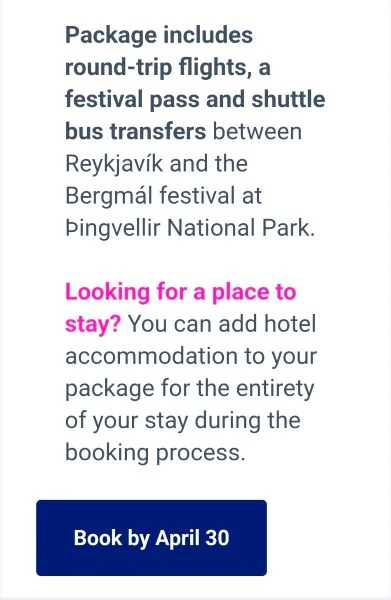
Why this CTA works
I love specificity in copy. It’s so much more trustworthy than vague concepts. The airline could have used “book now” here, but they nailed it by giving a hard deadline that travelers need to follow.
9. Lock in your campsite now
Hipcamp leans into the urgency of missing out on a great campsite during the busy camping season in its CTA.
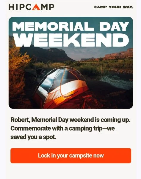
Why this CTA works
Seasonal promotions are time-sensitive by nature. Two aspects of this CTA example work to amplify the urgency. “Lock in” tells anxious planners they’ll have security once they book. And “now” ups the urgency.
Pro tip: Now is a versatile power word in marketing. When we studied top-ranked Google ads, we learned that “now” was one of the most used power words in that high-performing group.
10. Save now
This urgency CTA is perfectly positioned above the sales expiration date.
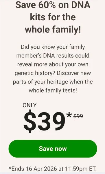
Why this CTA works
I wanted to show another example of “now” doing work in an urgent CTA. But that’s not all this ad got right. The microcopy sitting underneath the button reminds people that there is a very definite end to this promotion, so you’d better act fast.
Appointment and booking CTAs
If you run a service business or sell software via demo, you need to get bookings on the calendar. These CTAs do that with flair.
11. Book in 90 seconds
This CTA to book lawncare is all about convenience.
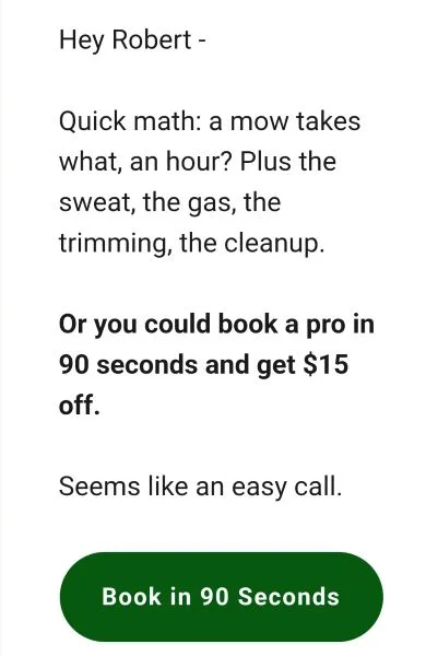
Why this CTA works
I can tell this business knows its customers. People don’t just call them for a tidy lawn; they’re looking to make life a little easier. The CTA promises that booking the service will be super simple, too.
12. Request time
Social media ad platforms typically offer a list of preset CTAs. Midas chose a lesser-used option here.
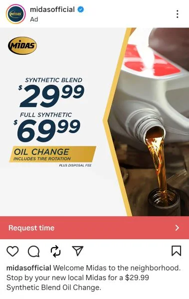
Why this CTA works
If you scroll long enough on social media, you’ll notice that most ads use a sparse few CTAs. “Learn more” is most common since it’s the default if you don’t pick one.
I like that this ad from Midas uses the CTA “Request time,” which stands out against a sea of the same options and feels a little more personal than “Book now.”
13. Prove yourself
The US Air Force generated a strong emotional appeal with just two words.
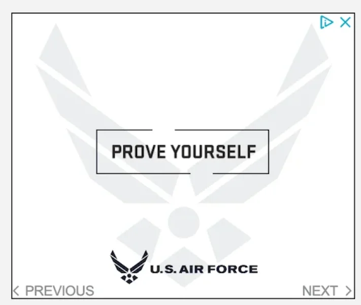
Why this CTA works
Calling a recruiter is the first step of a very big decision. “Book an appointment” isn’t going to do the job here. But “Prove yourself” is motivational. It’ll connect with the target audience.
Pro tip: Emotional copy is a conversion rate hack (boosting CVRs by 70% or more). Try out some of these emotional copy words for yourself.
14. No, I don’t want to grow my business
This secondary CTA highlights what can happen if you don’t book a demo call.
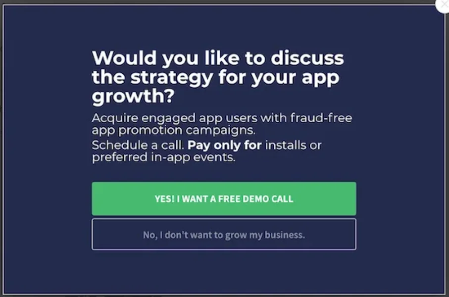
Why this CTA works
Secondary CTAs can do a lot of heavy lifting in guiding people towards a decision. Here, it positions the alternative as stagnant business growth—not something any app owner wants.
Engagement and community CTAs
CTAs can encourage any action. If you’re trying to grow your social following or get people to join your brand community, here are a few examples to use.
15. Follow HPM on Instagram here
Human Powered Movement manages several active events, like 5Ks and scavenger hunts. The backbone of their business is the local community, so their CTAs are designed to keep them engaged.
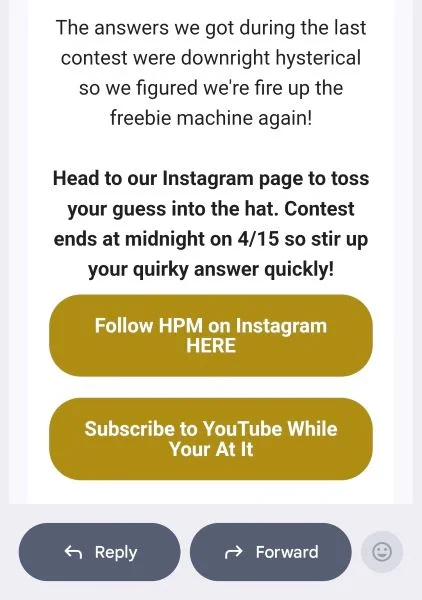
Why this CTA works
The first CTA is a matter of fact, which works because it’s the logical step to enter a giveaway. The second button’s copy adds a little personality. If you want people to take two actions, make it fun.
16. Stay informed. Stay competitive.
Fujitsu built three CTAs into this short ad.

Why this CTA works
The ad copy and button CTAs are all aligned to a single narrative that Fujitsu has the expertise, and if you follow them, you will too.
Content and education CTAs
You put a lot of effort into creating helpful content. These creative CTA examples will get more people to download, watch, and read it.
17. Get the guide
Impactdotcom doubled up on CTAs to make sure people downloaded their guide.

Why this CTA works
I mean, if one CTA is good, two is better, right? Actually, yes. The second one has much more contrast and is more explicit than the “download” bar. This is a solid, repeatable tactic for all your social media ads where CTAs are limited.
18. Yes! Give me my PDF
Here’s a strong, positive assertion to use in your next gated content CTA.
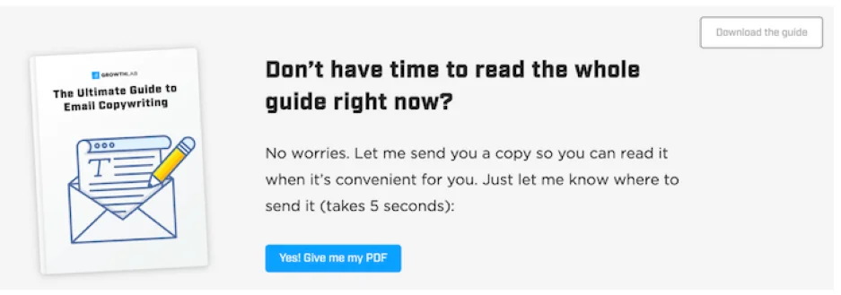
Why this CTA works
The “Yes!” is a nice start. It generates some energy. The real selling point is the use of “me my” here. Using a first-person angle gives people a sense of responsibility. Try swapping out “our” with “your” in your CTAs and see how it affects your conversion rates.
19. Yes! Teach me your secrets
This CTA example bundles a few strong tactics in one short phrase.
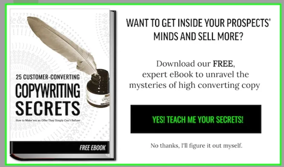
Why this CTA works
It has energy. It addresses the reader in the first person. There’s an action verb. And there’s a little mystery. And to top it off, there’s a secondary anti-CTA. This is one of my favorites.
20. How do we do that?
Here’s a CTA that uses a question to incite curiosity.
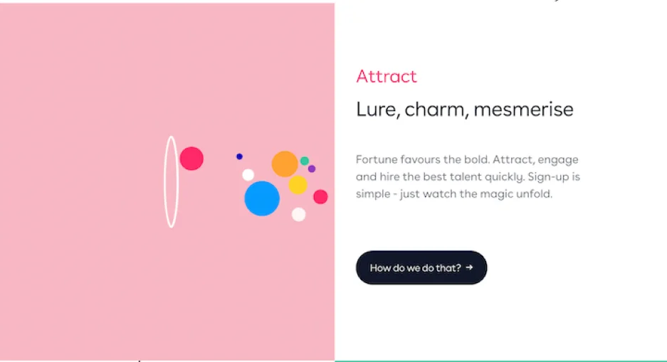
Why this CTA works
Curiosity is a powerful motivator, and the question on the button makes you wonder what’s on the other side. I could see this working for all sorts of solutions. For example, if you clean carpets, you could include an image of a very dirty carpet with one clean strip down the middle and a CTA of “how’d we get it so clean?” I’d want to know.
Pro tip: The curiosity gap is a useful headline writing formula, too.
21. Take me to the blog
In this example, we see the three most recent blog posts on a website’s homepage with a call to action to go to the blog.
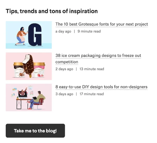
Why this CTA works
Instead of “Visit the blog” or “Go to the blog,” “Take me to the blog!” has more pep in its step. It’s also another example of shifting the action to the visitor.
22. Push for fun
Here’s a whimsical little CTA that keeps it light.
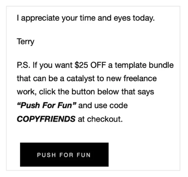
Why this CTA works
When taken out of context, this CTA doesn’t feel trustworthy. But since the newsletter is fun and there are specific instructions that tell you to click the “Push For Fun” button, it works.
While I love a great pun and clever copy, just make sure it’s not coming out of left field. If everything else you send is serious, a silly CTA won’t land.
23. Worry less. Roof smarter.
Owens Corning looks to ease the anxiety of reroofing your house.
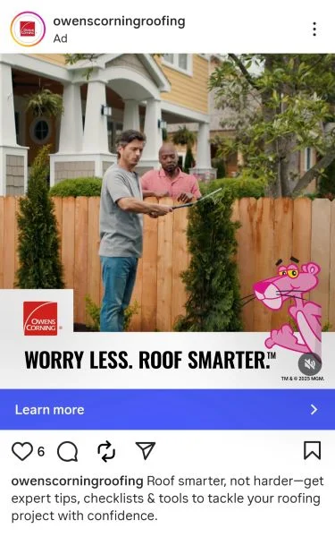
Why the CTA works
Great copywriting eases pain. That’s what the CTA gets right. It ties the education on the other side of the click to education that’ll demystify the roofing process.
Referrals and word-of-mouth CTAs
A referral marketing program is among the best lead generation sources you can have. The people your best customers bring in will have more trust and knowledge than someone who clicked an ad. These referral CTA examples get clicks by focusing on “What’s in it for me?”
24. Earn up to $5,000
Instead of attracting customers, this dental group uses its CTA to attract new providers.
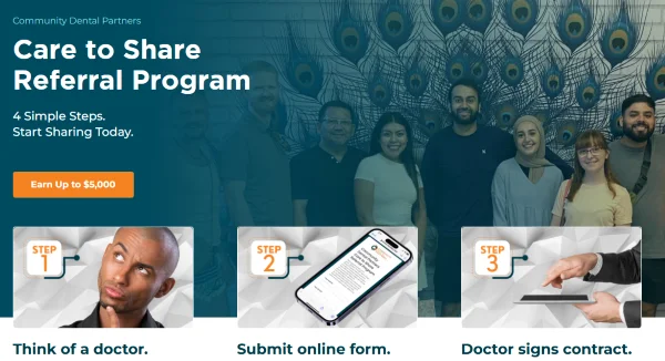
Why this CTA works
The offer matches the value of the ask. In this case, visitors have to do a little work—and recommend a viable provider—in order to reap the reward. Highlighting the significant payout in the CTA is a smart way to show that it’s worthwhile.
25. Refer a friend
This simple referral CTA is backed by valuable offers.
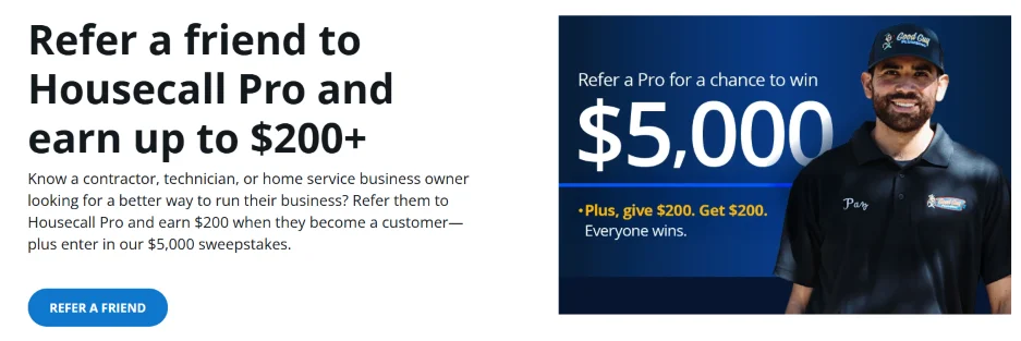
Why this CTA works
You don’t always need super flashy phrasing on your CTA button. I wanted to give an example of when it’s OK to stick with the old standards. The headline in this copy is so clear and provides such a valuable offer that an overly clever CTA could derail the momentum.
For this one, the copy is straightforward, and the button is placed right where your eyes will go after reading the headline.
26. Start earning
Jackson Hewitt’s referral CTA is a smooth way to say you’re getting paid.
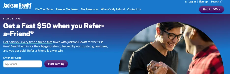
Why this CTA works
The phrasing is immediate. Just click this button, and you’ll start collecting referral cash. It helps that the only ask up front is for your zip code. Requiring more personal data might turn some people away, especially in this early stage of the process.
Subscription and lead generation CTAs
These call-to-action examples stoke curiosity and FOMO to get new subscribers and generate leads.
27. Yes! It takes a village
Mable + Moxie place a risky, but effective, bet on communal comprehension in their CTA.
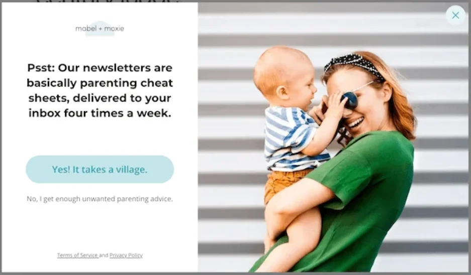
Why this CTA works
Including axioms that a group of people understands can be a great way to prove your copy is for them. But using one as your CTA is risky because any confusion there can cost you conversions.
I like the use of “it takes a village” here, though. It’s a well-known enough truism, especially among parents, that it shouldn’t push people away. And it serves as a reminder that we could all use some help when it comes to raising kids, which sets up the offer of parenting advice well.
28. Convince people you know what a DSP is
Digiday’s newsletter CTA is a brilliant example of speaking your audience’s language.
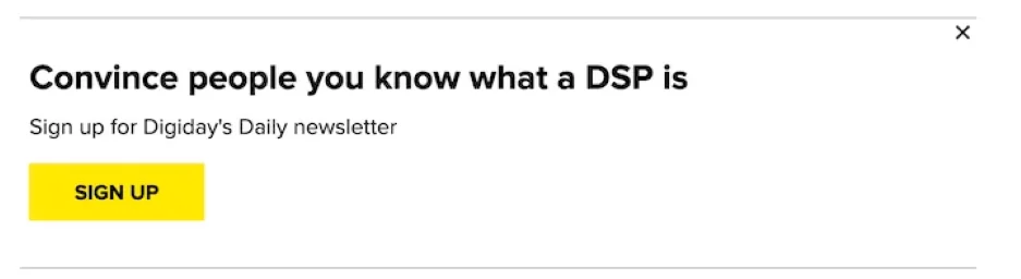
Why this CTA works
“Sign up” is on the button, but the real CTA is the header, here. It’s one of the best examples I’ve seen of copy that both qualifies the audience and solves a pain they have. If you’re among the group of people who need to sound smart about DSPs (and other technical marketing topics), but you’re not already an expert, Digiday’s newsletter is for you.
29. Get free access to everything
Sleeknote combined a bold headline and CTA to build its email list.
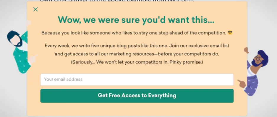
Why this CTA works
I like the grand gesture of offering “free access to everything” here. I’ve seen versions like “get everything, for free, always” that feel so compelling. And the headline sets up the offer nicely by creating a little FOMO.
30. Yes, I’m the best pet parent
This CTA tugs on the heartstrings of pet owners.
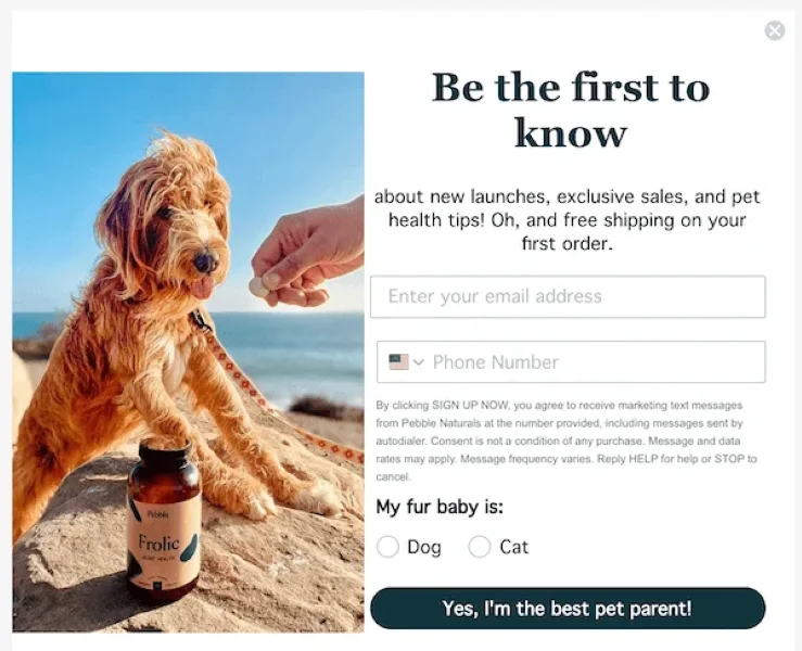
Why this CTA works
This is a great example of using psychology in marketing—in particular, the commitment and consistency bias, which says that we make decisions that are in line with who we’ve declared ourselves to be. If you love your pet (and who doesn’t), then not signing up for this newsletter is inconsistent with this self-perception. See what they did there?
31. Calculate payment
When you use free tools as lead magnets, an action-based CTA like this one is a great option.
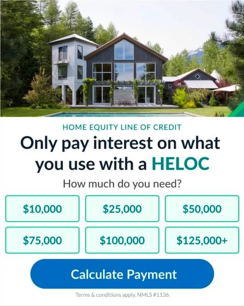
Why this CTA works
The CTA doesn’t jump out as terribly compelling until you consider an alternative. “Use the calculator,” for example, would be a straightforward option. But “Calculate payment” does a much better job of highlighting the result.
4 expert tips to write incredibly effective calls to action
We’ve seen how other brands use CTAs to get more followers, subscribers, leads, and sales. Let’s break down a few ways you can do the same.
Anchor your CTAs to outcomes
Common wisdom says a CTA needs to tell the viewer what to do next. That’s true, but it also needs to tell them how they’ll benefit by doing it.
“One of my best tips for writing CTAs is to anchor them to clear outcomes,” Cliff Sizemore, senior growth marketing manager at LocaliQ, said. “If I’m promoting a free tool like our Google Ads Grader, I’ll use something specific like ‘Start improving your ad performance.’”
“Click here” or “use the free tool” isn’t nearly as compelling. It puts more emphasis on what the viewer will do, instead of what they get.
Think about what your customer will achieve by taking the next action (like, “reduce foot pain” or “make mowing easier”) and write a CTA around it.
Use value words
CTAs are no time to be humble. What you offer is fantastic, and the person reading your CTA needs to know it.
That’s not just my opinion. In our study of highly rated Google Ads, we learned that more than half included at least one value word. “Free” and “quality” were among the most used.
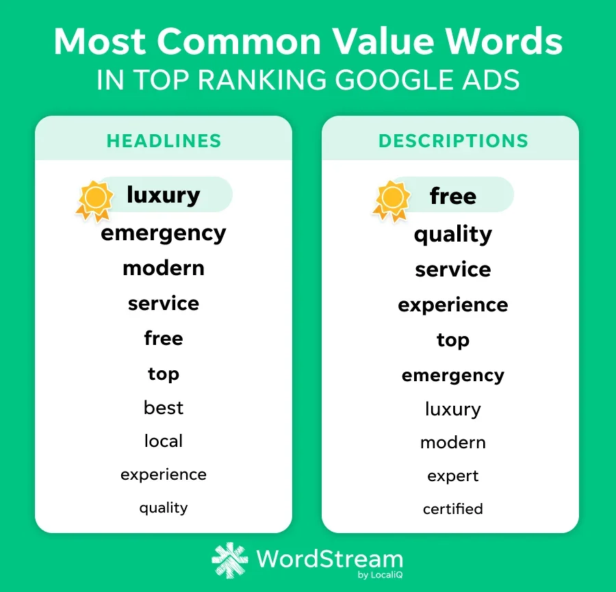
Try a CTA variation like “Get top advice” instead of “Subscribe” to see how it works with your audience.
Align your CTA with the offer
Cliff said it’s important to “match the strength of the CTA to the intent of the landing page.” Meaning, your CTA should match where your visitor is in their journey. A cold audience needs a low-stakes ask, while someone on your pricing page is ready for a more direct approach.
Say someone lands on a cold awareness page like a general “what is X” explainer blog post. They’re early in their journey, and a hard sell like “Buy Now” or “Request a Demo” is going to feel jarring. The CTA should be low-commitment: “Download the Free Guide,” “See How It Works,” or “Get the Checklist” would be better segues.
Conversely, “Get a quote” or “Start your free trial” is better for a pricing or comparison page.
Add microcopy around the CTA to remove doubt
Fear can keep an otherwise great prospect from taking a leap with your business. You can alleviate their anxiety with a few words just below the CTA.
“Hesitation peaks right before the click,” Oskar Duberg, a freelance writer, content marketer, and brand consultant, recently wrote. “Tiny clarifications at that moment can quietly save conversions.”
Oskar suggests adding bits of copy that address time, risk, effort, privacy, and what happens next. For example:
- Takes less than 2 minutes
- Get a reply within 24 hours
- No credit card required
Call to action example FAQs
Let’s cover a few CTA basics with these frequently asked questions.
What is acall to action?
A call to action, or CTA, is a word, phrase, or button that tells your audience exactly what to do next—like “Buy Now,” “Download the Guide,” or “Get a Free Quote.”
Why are CTAs important?
CTAs increase conversion rates by giving visitors clear directions and compelling reasons to take whatever action you’ve designated as the next step in their journey with your business.
Where can you use a CTA?
CTAs can be used virtually anywhere you’re communicating with a customer. That includes ads, emails, landing pages, social media posts, blog posts, videos, direct mail, and even receipts or product packaging.
Get more conversions with these call-to-action examples
If your ad, email, or webpage isn’t converting, it may not be your offer or product. It might simply be that your CTA hasn’t grabbed attention, provided a clear solution to a known pain, or made the value of clicking clear enough.
Writing these types of uber-compelling CTAs isn’t always easy. But you have two things in your corner. First, these examples show a variety of ways to write high-converting CTAs. And second, A/B testing CTAs is a quick and conclusive way to know which ones work best.
There are dozens of factors that influence audience growth, lead generation, and conversion rates. We’re here to help! Let us show you how our solutions work to get your business found over and over again.